Selling to the C-Suite
CoolPlanet had built a strong product for site-level facility managers: the people on the ground, managing individual buildings and industrial sites. But the business was shifting its sales strategy. Instead of winning customers one site at a time (which could take years), the sales team wanted to target C-suite executives who controlled portfolios of dozens or hundreds of sites across multiple countries.
The problem was that these executives couldn't get what they needed from the platform. Questions like "how does our UK portfolio compare to our US operations?" or "which sites are underperforming on energy efficiency?" were reasonable things to ask, but answering them required manually pulling data from each site individually. No executive was going to do that.
This wasn't speculative work. Sales had already been promising the feature to prospects, and contracts were dependent on it being delivered. The deadline was fixed. I was responsible for architecting the solution and coordinating delivery across the majority of our engineering team.
What We Were Building
In concrete terms, we were building a suite of dashboards that could aggregate energy, emissions, and operational data across an entire portfolio of industrial sites. An executive could log in, see all their sites in one view, compare performance, and drill down into specific regions or equipment categories.
The product team put together an overview video for customers explaining what the enterprise dashboards were all about. It's a bit corporate (you've been warned), but it does a decent job of showing the scope of what was delivered.
That's a Lot of Data
Each of those big summary numbers on the dashboard looks simple enough. But behind every single figure is a multiplication problem. To show total energy consumption across a portfolio, you need to query every site, for every equipment category, across every relevant data source, over whatever time range the user has selected. The numbers add up fast:
A single executive loading a single dashboard could trigger thousands of individual data queries, all derived on-demand.
All of this data was derived on-demand. No materialised views, no pre-computed rollups. Every query went through a single SkySpark instance (a proprietary time-series engine that isn't cloud-native and can't horizontally scale). If that instance went down, all time-series data across the entire platform for every customer would be unavailable for 5 to 10 minutes until automatic recovery kicked in. Now imagine multiple executives in the same boardroom, each on their own device, each triggering independent full data loads. That's the scenario we had to design around.
There was no option to throw hardware at it. The infrastructure didn't support pre-aggregation or materialised views. Whatever we built had to work within these constraints, not around them.
Pragmatic Decisions Under Deadline
With a fixed deadline and a single-instance bottleneck, we didn't have the luxury of building the ideal system. Every decision was about what would actually work in time.
Semantic Tagging
The core aggregation challenge was that no two industrial sites are the same. At the broadest level, different verticals have fundamentally different equipment: a pharmaceutical plant has nothing in common with a glass manufacturer. But even within a single vertical, a food processing facility in the UK might have a different arrangement of machines, different numbers of instances, or slightly different setups influenced by local conditions compared to a food processing plant in Poland. It's still fundamentally the same process, but the specifics vary. You can't just sum numbers across sites without some way to classify what you're comparing.
Rather than building a new system-level semantic layer (which would have blown the deadline), we repurposed the existing custom tagging system with a canonical convention of 150+ SEU (Significant Energy User) tags: CHILLERS, BOILER, AHU, and so on. The idea was to reuse existing infrastructure with an agreed convention, rather than build new data models under deadline pressure.
Fleshing out that convention across 150+ equipment categories required a lot of collaboration with subject matter experts, which thankfully we had plenty of within the company. The trade-off was that internal teams still needed to manually tag each site's equipment afterwards. Automation would come later. The priority was to ship something useful, not build the perfect system that arrived too late.
Hardcoded KPIs
We chose a fixed set of KPIs (energy inputs/outputs, Scope 1 and 2 emissions, energy intensity per unit of production, operational drift) with hardcoded thresholds for RAG colouring. We deliberately avoided building a configurable KPI framework before understanding what customers actually needed.
This turned out to be the right call. Those hardcoded KPIs remained sufficient for nearly two years. The only tenant-level customisation was SEU category opt-in (glass manufacturers have very different energy users to food processing plants). There was only sufficient demand for full configurability years after the initial release. Sometimes the pragmatic choice is the right one.
Site Grouping
We introduced a flat grouping layer alongside the existing hierarchical site-node structure. Admins could create arbitrary groups (by region, business unit, process, feedstock) and assign sites to them. On the surface this seems straightforward, but it solved two problems at once. First, it matched how executives actually think about their organisations: not by technical hierarchy but by business geography or function. Second, it gave us a natural splitting point for lazy loading. Instead of querying every site in the portfolio, users could scope a dashboard to a site group and only load the data they needed.
Dashboard Types
The feature shipped with three core dashboard types, each available at global, site group, or individual site level. The global views aggregated across the full portfolio, site group views scoped down to a selected grouping, and local views showed individual sites in the same format for consistency.
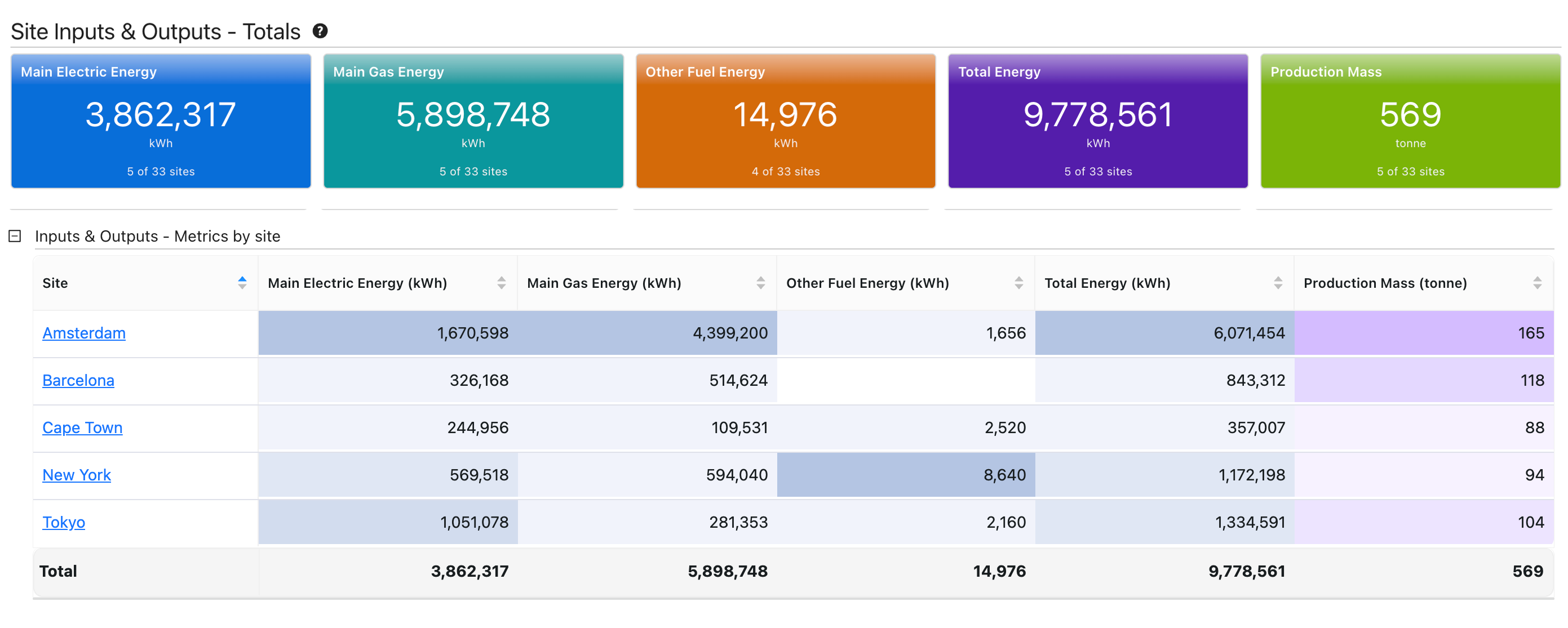
The main overview. Summary cards at the top show portfolio-wide totals for energy inputs, gas, other fuels, total energy, and production mass. Below, a per-site table breaks these down so executives can compare individual sites at a glance.
Managing Load
Given the SkySpark constraint, the performance strategy was almost entirely UX-driven. We couldn't speed up the queries, so we focused on making fewer of them:
- Viewport-based lazy loading: only load data for widgets visible on screen. A dashboard with 20 widgets only fires queries for the 4 or 5 you can actually see.
- Site groups as natural scoping: encouraging regional views ("EMEA" or "North America") rather than global queries reduced query scope significantly.
- Incremental layout: top-level summary widgets loaded all-site data, but detail widgets only loaded data for visible or selected sites.
- Session caching: once data was loaded, navigating between views didn't re-trigger expensive queries.
- License-gated rollout: enterprise dashboards required additional licensing, so there was a natural gradual increase in load as customers onboarded. This bought us time for scalability improvements downstream.
Coordinating the Team
The majority of our development team was working on this. I created a master development plan and presented it to the full team, breaking the work into workstreams. Once the interfaces between workstreams were agreed, most of them ran in parallel.
Each workstream had an assigned owner. Most ran in parallel once interfaces between them were agreed.
Each workstream had an assigned owner. I was wearing two hats throughout: line manager of the developers and software architect for the feature. That meant architectural decisions and technical decomposition, but also team coordination, workstream assignment, and being available to jump in and support anyone who got stuck. As things came down to the wire, there were a number of pieces I ended up implementing myself to make sure we hit the deadline.
What Happened
We hit the deadline. In the words of our CEO:
"We actually signed 3 nice software contracts in the one day yesterday. All these deals are Enterprise deals, which means they use our new enterprise functionality and we have gone from zero to many sites on day one. Something that has not happened in the history of the platform. This is a game changer and really justifies the direction we took with the platform."
Alan Keogh, CEO, internal announcement
One of those contracts covered 30 sites, another 45. Previously, building a multi-site customer relationship took years of winning site by site. With enterprise dashboards, customers committed to many sites upfront (typically phased rollouts over months or years, but contractually committed to from day one). The feature became separately licensable, and enterprise became the default way the company sold the product going forward.
Once the deadline pressure was off, we progressively enhanced the dashboards based on real customer feedback: RAG colouring for operational drift, pie charts and combo charts, site group filtering on global dashboards, and guest dashboard access for secure read-only sharing with external stakeholders.